
When it comes to studying design in the 1950s, this 1957 Chevy ad is classic: A rainbow of eye-popping pastels, design that is long and low and angles and flourishes that suggest speed. But just like today, there wasn’t just “one” look in the 1950s — there were several. Some looks gained popularity as technology, tastes and social mores evolved… while some ran concurrently, recognizing that the U.S. is a diverse, individualistic, creative nation.
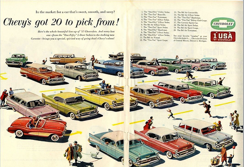
1950s Chevrolet Ad
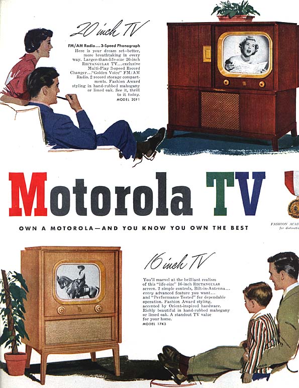
1950s Motorola TV ad
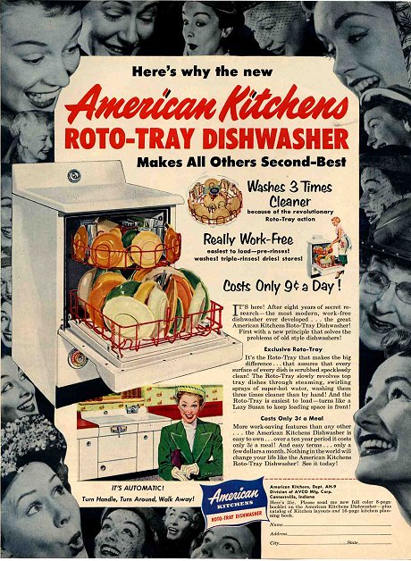
1952 Advertisement
Influential Designers
That doesn’t mean, however, that the advertising and design of the ’50s is not to be taken seriously. The mid-century modern period was dominated by American innovations. Inspired by European avante-garde early modern approaches, American designers developed a unique style and several influential designers emerged.
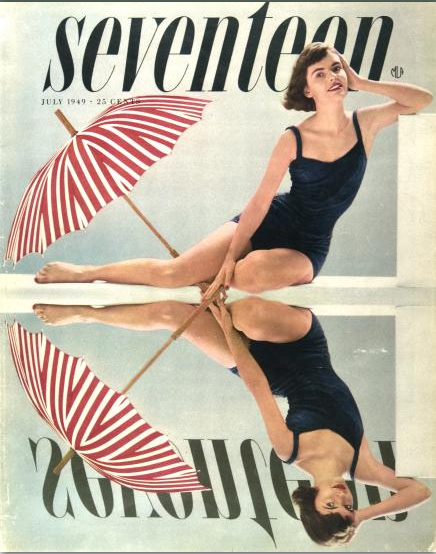
Cipe Pineles. 1949 Seventeen Magazine
CIPE PINELES
Cipe Pineles (1908-1991) was one of the most prominent designers of the twentieth century and one of the first female art directors to work at a major magazine. She served in that capacity at Glamour, Seventeen and Charm. For more about Cipe Pineles see: http://www.aiga.org/medalist-cipepineles/
PAUL RAND
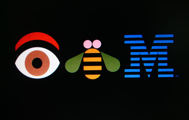
Paul Rand
Paul Rand (1914-96) was a pioneering figure in American graphic design. Adopting what he called a ‘problem-solving’ approach, he drew on the ideas of European avant-garde art movements, such as Cubism, Constructivism and De Stijl, and synthesized them to produce his own distinctive graphic language. As an art director, teacher, writer and design consultant to companies including IBM and UPS, he was a major force and influence in the field of graphics and visual communication.
Below is a short film tribute to Paul Rand
SAUL BASS
Saul Bass (1920-1996) was not only one of the great graphic designers of the mid-20th century but the undisputed master of film title design thanks to his collaborations with Alfred Hitchcock, Otto Preminger and Martin Scorsese.
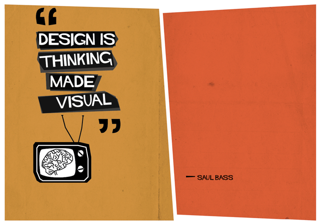
Saul Bass
When the reels of film for Otto Preminger’s controversial new drugs movie, The Man with the Golden Arm, arrived at US movie theatres in 1955, a note was stuck on the cans, “Projectionists – pull curtain before titles”. Until then, the lists of cast and crew members which passed for movie titles were so dull that projectionists only pulled back the curtains to reveal the screen once they’d finished. But Preminger wanted his audience to see The Man with the Golden Arm’s titles as an integral part of the film. It was so well received by audiences, that a new graphic medium was born: motion graphics.
Bass was also know for designing major corporate identity for United Airlines, Quaker Oats, AT&T, and many others.
Watch the original “Man With The Golden Arm” title sequence on YouTube: http://www.youtube.com/watch?v=3sA1en26sgM
For more about Saul Bass: http://library.rit.edu/gda/designer/saul-bass
OTHER MID-CENTURY SUPERSTARS
Lester Beal, Herb Lubalin, the Madison Avenue “ad men”, and many others should be on this page but others have written much better biographies that I see no need to repeat them here. Instead, I recommend the following profiles located on History Graphic Design blog:
 Graphic Design History
Pingback: Post War 1945-1965 | Green Graphic Design History
Pingback: Using reference |
Pingback: VCDS II Project 3 – Display Design Research – Armando Mazzacani
Pingback: Key Steps in Illustration: Exercise 7, pt. 2 – Kat illustrates
Pingback: Research Project 3 | Daniimagery